
TL;DR

Get kitchen staples and gadgets delivered free with Prime
- Fast, free delivery on millions of items
- Prime Video, Amazon Music and more included
- Member-only deals all year
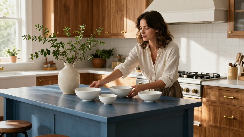
Ina Garten shared a kitchen styling tip in a post on her Substack: choose a small color palette for displayed items, such as white china and silver. The advice focuses on coordinating pieces already on view, rather than replacing kitchenware or renovating, though the source does not specify when the post appeared.
Ina Garten has recommended choosing a small color palette for kitchen displays, suggesting combinations such as white china and silver in a post on her Substack. A Good Housekeeping report presents the advice as a low-cost way to make visible kitchenware feel more coordinated without replacing dishes or remodeling.
Garten’s advice is to settle on a limited set of colors and use it consistently among pieces displayed in the kitchen. “Choose a small color palette and stick to it, such as white china and silver,” she wrote, according to Good Housekeeping. The suggestion does not require every item to match exactly: the report says different shapes, materials and undertones can sit together while keeping to a restrained palette.
The practical point is to work with what is already on hand. Homeowners can choose a few complementary colors for dishes, trays or serving pieces they keep visible, rather than buying a full new set or changing cabinets. White and silver are offered as one classic pairing, but Garten’s rule can be adapted to other colors that suit a household’s existing kitchen and belongings.
Garten also recommends mixing older and newer pieces and varying their shapes and heights. “Choose different shapes—round, flat, plus different heights—to sit next to each other,” she said in wording cited by Good Housekeeping. For open shelves or glass-fronted cabinets, the report suggests that a platter leaned against a wall, a stack of cookbooks or a wireless table lamp can add variation to the arrangement.
A Palette That Works With Existing Dishes
The advice matters for readers because it offers a styling change that does not depend on a renovation or a large purchase. A limited palette can give displayed objects a shared visual thread, while allowing a collection to grow gradually as items wear out or new pieces are added. That is relevant to people who prefer to keep kitchenware for years rather than replace it to follow changing trends.
The report’s interpretation is that white and silver can pair with many styles and remain useful as tastes change. That is a design judgment, not a guarantee that every kitchen or collection will look timeless. The underlying method is broader: choose colors that work with the room and existing items, then use them consistently enough for the display to feel intentional.
Garten’s suggestion also treats everyday objects as part of the room’s appearance. She said displaying dishes and trays that people “actually use and love” can make a kitchen feel alive. The practical balance is between visual order and personal use: the display can include functional items without requiring a perfectly uniform set.
As an affiliate, we earn on qualifying purchases.
Garten’s Display Advice
The Good Housekeeping report says Garten has used creamy cookware and muted bowls alongside silver cake stands and pitchers in posts on Instagram. That observation provides an example of the palette described in her Substack advice, but it does not establish that every item in her kitchen follows the same scheme.
Her recommendations extend beyond color to arrangement. Garten favors combining older and newer objects, using different shapes and heights, and showing items people use. She has also described her workplace at the barn with the line, “Every day when I arrive at the barn, I think, ‘I can’t believe I get to work here.’” In the report, she hopes attractive displays can help people feel similarly positive about their own kitchens. The supplied material does not give a date for the post or identify a new product, renovation or formal design launch tied to the tip.
The Post’s Timing and Scope
The supplied report does not state when Garten published the Substack post, so its timing cannot be pinned down here. It also does not provide measurements, a formal design plan or evidence that a particular color combination improves how a kitchen functions. The description of white and silver as timeless is design guidance, not a factual claim that the pairing suits every home.
It is also unclear whether Garten intended the palette as a general rule for all kitchen items or specifically as guidance for pieces left on display. The quoted wording and examples concern visible dishes and accessories. The report does not say that readers need to change cookware or storage that is kept out of sight.
A Tip to Adapt at Home
No product release, event or follow-up announcement is identified in the supplied material. Readers can apply the advice by looking at the dishes and serving pieces they already display, choosing a small group of colors that works with their kitchen, and arranging items with varied shapes and heights. Open shelves and glass-fronted cabinets are suggested ways to show such collections, but they are not prerequisites.
For now, the development is the circulation of Garten’s decorating guidance through Good Housekeeping’s report. Any additional advice or clarification would depend on further posts from Garten or subsequent reporting; neither is specified in the source material.
Key Questions
What is Ina Garten’s kitchen styling tip?
She recommends choosing a small color palette for displayed kitchen items. One example she gives is white china and silver.
Do I need to buy new dishes to follow the advice?
No. The Good Housekeeping report says the tip can be applied to pieces already on display by choosing a few complementary colors. It does not call for a new set of dishes or a kitchen renovation.
Does Garten say every item must match?
No such requirement appears in the cited advice. Garten recommends mixing shapes, heights and older and newer pieces, while keeping the palette limited.
Where did Garten share the advice?
According to Good Housekeeping, Garten shared the color-palette suggestion in a post on her Substack. The supplied report does not give the post’s publication date.
Source: rss
Halloween Picks
halloween
As an affiliate, we earn on qualifying purchases.