
To prevent your bottles from becoming unreadable, you should choose font sizes between 12-16 points for small bottles and up to 24 points for larger ones. Use clear, easy-to-read sans-serif fonts like Arial or Helvetica, and guarantee high contrast between text and background colors. Keep your design simple and consistent, using hierarchy to make key details stand out. If you want to create effective labels that are attractive and easy to understand, keep exploring these essential tips.
Key Takeaways
- Use font sizes between 12-16 points for small bottles to ensure readability.
- Choose clear, sans-serif fonts like Arial or Helvetica for better clarity at small sizes.
- Maintain high contrast between text and background, such as black on white, to improve visibility.
- Establish a visual hierarchy with larger fonts for headings and smaller for details to guide the viewer.
- Avoid mixing too many font sizes; keep consistency to prevent clutter and enhance message clarity.
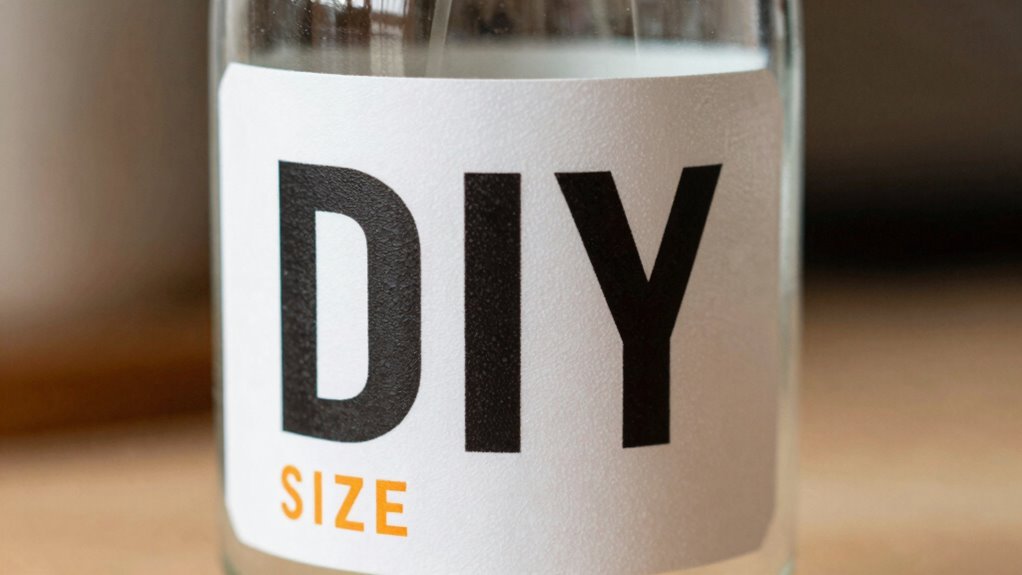
Ever wondered how to create eye-catching labels without breaking the bank? The secret lies in mastering a few simple design principles, especially when it comes to choosing the right font size. When designing DIY labels, readability is key. If your font is too small, people won’t be able to read what’s on the bottle, defeating the purpose of labeling altogether. Conversely, overly large fonts can look awkward and cluttered. The trick is to find a balance that makes your label both attractive and legible.
Start by considering the typography tips that make a big difference. Choose a font style that’s clear and easy to read at a glance. Sans-serif fonts like Arial, Helvetica, or Futura tend to be more legible for small labels because they have clean lines without decorative strokes. When selecting font size, think about the size of the bottle or container. For small bottles, a font size between 12 and 16 points usually works well. For larger bottles, you can go slightly bigger, but avoid exceeding 24 points unless you want a bold statement piece. Remember, the main goal is to guarantee that your text stands out without overwhelming the design.
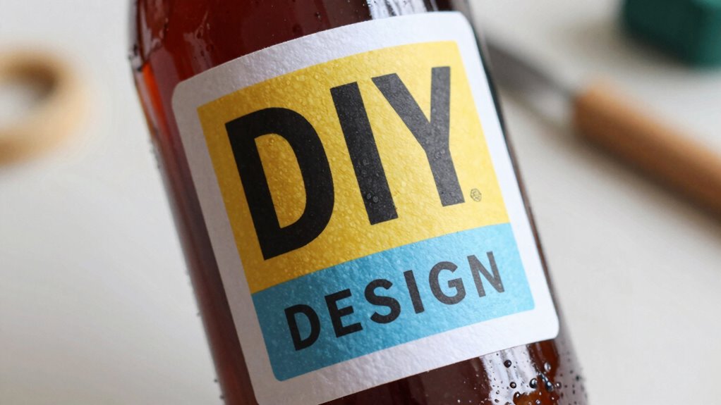
Color schemes also play a vital role in creating an effective label. High-contrast color combinations—such as black text on a white background or dark blue on light yellow—make the text pop and improve readability. When choosing your colors, keep in mind the overall aesthetic you want to achieve, but don’t sacrifice clarity for style. Stick to a limited palette to prevent your label from looking cluttered. Using bold or contrasting colors for the text against the background helps the important details stand out, making sure your label is both attractive and functional.
Another tip is to keep your font size consistent throughout the label. Mixing too many sizes can confuse the viewer and make the label look disorganized. Instead, use hierarchy—larger fonts for headings and smaller fonts for secondary information—to guide the eye naturally across the label. This way, even if someone glances quickly, they’ll catch the essential details effortlessly.
Additionally, understanding load calculations and safe installation practices ensures that your labels are not only attractive but also durable and properly applied, which is essential for long-term readability. In the end, creating eye-catching labels isn’t about complex design tools or expensive materials. It’s about understanding how typography tips and color schemes work together to make sure your message is clear and appealing. By paying attention to font size and contrast, you’ll guarantee your DIY labels are not only attractive but also easily readable—preventing those frustrating “unreadable” bottles and making certain your homemade creations shine.

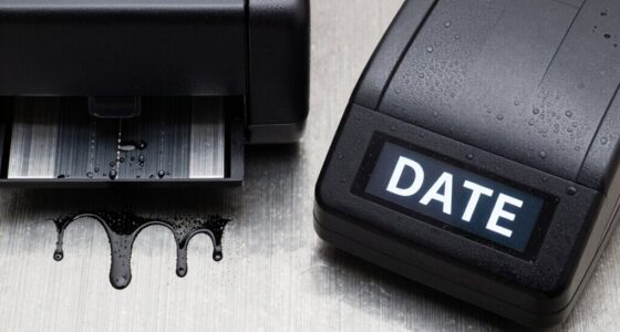
SUPVAN T50M Pro Bluetooth Label Maker Machine with Tape, Wide Waterproof Label, Versatile App with 30+ Fonts and 660+ Icons, Inkless Labeler for Home, Kitchen, School, Office Organization, Black
- For Home and Small Business: Prints 3/4" – 2" wide…
- Versatile App Editing Function: Easily add images from your…
- Enhanced Image Quality: The App delivers precise image…
As an affiliate, we earn on qualifying purchases.
As an affiliate, we earn on qualifying purchases.
Frequently Asked Questions
How Do I Choose the Right Font Style for My Label?
You should choose a font style that complements your label’s theme while ensuring readability. Use font pairing wisely by combining a bold, clear font for the main text with a more decorative one for accents. Maintain a strong font hierarchy by varying sizes and weights, making important info stand out. Avoid overly fancy fonts that can hinder readability; simplicity always wins for clear, attractive labels.
What Materials Are Best for DIY Label Printing?
You should choose waterproof label materials like vinyl or polyester for durability and water resistance, especially if your bottles get wet. Consider printing techniques such as inkjet or laser printing, which work well on these materials and produce clear, long-lasting images. These materials and methods guarantee your labels stay intact, look professional, and remain legible, even with frequent handling or exposure to moisture.
Can I Use Digital Tools for Designing Labels?
Absolutely, you can harness digital design tools to craft stunning labels. Think of these tools as your creative paintbrushes, allowing you to customize every detail with precision. They make label customization a breeze, giving you the freedom to experiment with fonts, colors, and layouts. With digital design, you transform your ideas into professional-looking labels that stand out on the shelf, making your DIY project not just personal, but polished.
How Do I Ensure Labels Are Waterproof and Durable?
To guarantee your labels are waterproof and durable, apply waterproof coatings like lamination or weatherproof adhesives. These protect your design from water, moisture, and wear. Additionally, perform durability testing by exposing samples to water and friction to verify their resilience. This way, you’ll create labels that stay intact and legible, even in challenging environments, ensuring your bottles look professional and last longer.
What Are Common Mistakes to Avoid in Label Design?
Like a painter choosing the right palette, you should avoid mismatched font pairing and poor color contrast. These mistakes make your labels hard to read and less appealing. Guarantee fonts complement each other and contrast sharply with the background. Don’t overcrowd the design or use tiny fonts. Keep it simple, balanced, and legible. Your labels will communicate clearly and look professional, avoiding visual confusion and enhancing shelf appeal.
Conclusion
So, next time you’re designing a label, remember this simple font size rule. Imagine your bottle sitting on a shelf, catching someone’s eye—but only if they can read it easily. Miss the mark, and your label becomes just a blur. Stick to the right size, and your design will stand out clearly, inviting curiosity. The secret to a perfect label is within your reach—are you ready to make it unforgettable?