To create eye-catching juice labels, choose pens like fine-tip markers for detailed scripts and broad brushes for bold strokes. Incorporate paints such as textured acrylics or watercolor washes to add depth. Use techniques like layering ink effects, hand lettering with playful or elegant styles, and adding hand-drawn embellishments to make your design unique. Paying attention to materials and styles will help your labels stand out—keep going to discover even more ways to craft stunning labels.
Key Takeaways
- Use fine-tip markers or brush pens to achieve detailed, clean lettering suitable for juice label designs.
- Incorporate broad brushes or textured paints for bold, expressive strokes that add character.
- Experiment with watercolor washes and layered ink techniques to create depth and artisanal effects.
- Choose pens and paints that match your desired style—playful, elegant, or rustic—to enhance brand personality.
- Practice various lettering techniques like hand lettering, calligraphy, and faux-lettering to develop a unique style.
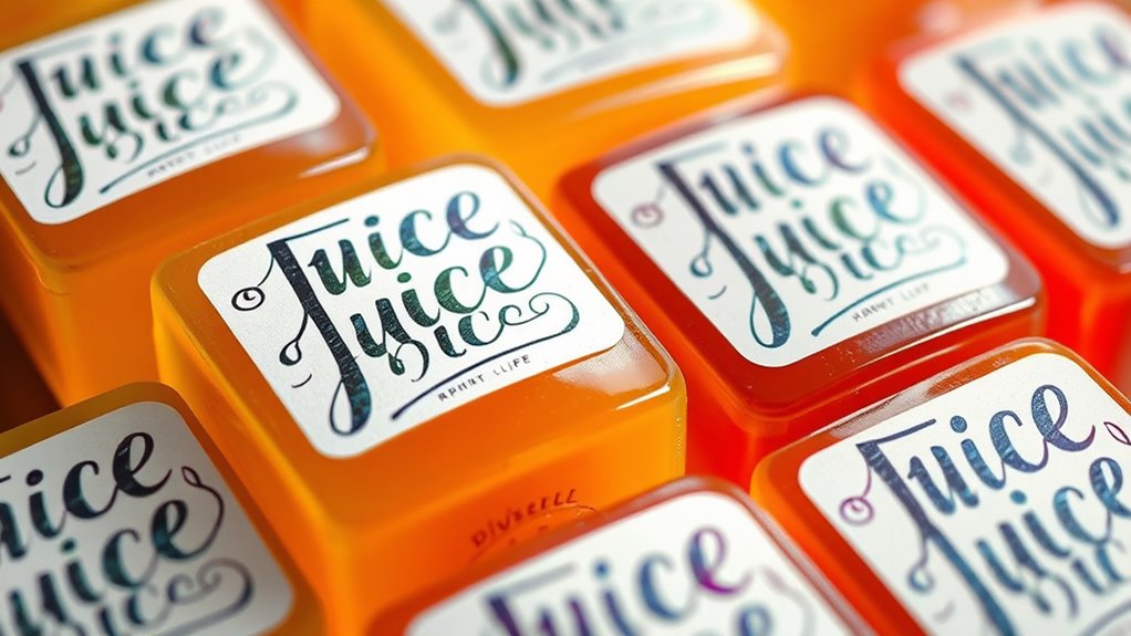
Have you ever noticed how hand-lettered juice labels can make a product stand out on the shelf? It’s all about the details—how the typography styles and color palette choices work together to catch the eye and communicate freshness. When you’re designing these labels, the first thing to consider is typography styles. Whether you opt for bold, playful lettering or elegant, flowing scripts, the style you choose should reflect the juice’s personality. For a vibrant, fruity flavor, chunky or rounded fonts can evoke fun and energy. Conversely, a more refined script might suggest a premium or organic product. The key is consistency; your typography should complement the overall vibe of your brand and the message you want to send.
Effective juice labels use typography styles that reflect the flavor—bold and playful for fun, elegant for premium.
Color palette choices also play a vital role in making your label pop. Bright, bold colors like citrus yellows, berry reds, and lush greens immediately draw attention. These colors not only make your label visually appealing but also hint at the flavor inside. When selecting your palette, think about how the colors will interact with your typography. For instance, dark lettering on a light background ensures readability, while contrasting colors can create dynamic visual interest. You might use a soft pastel for a calming vibe or neon accents for a lively, energetic look. The palette should harmonize with your typography styles—delicate fonts paired with muted shades might give a sophisticated feel, whereas chunky fonts with vibrant hues can evoke fun and excitement.
As you experiment with pens and paints, keep in mind that the materials you choose influence the style and texture of your lettering. Fine-tip markers are perfect for detailed script work, while broad brushes or paint pens can create bold strokes that stand out from afar. For a more artisanal touch, you might incorporate textured paints or layered ink effects to add depth. Techniques like watercolor washes or hand-drawn embellishments can give your label a truly unique, handcrafted appearance. Remember, the goal is to make your juice label not just readable but also memorable. The combination of the right typography styles, carefully chosen color palette, and skilled techniques will help your product catch a shopper’s eye and convey the quality and personality of your juice.
In addition, studying successful hand-lettered labels can provide inspiration and help you develop your own signature style for your products through consistent branding. Ultimately, hand-lettering isn’t just about aesthetics; it’s about storytelling. Your choices in typography and color tell a story about your juice—whether it’s fresh, natural, fun, or luxurious. By paying attention to these details, you’ll create labels that not only look beautiful but also resonate emotionally with your customers, making your product impossible to ignore on the crowded shelf.
Frequently Asked Questions
What Are the Best Tips for Beginners in Hand-Lettering?
Start with simple brush strokes to build confidence and control your hand movements. Focus on consistent letter spacing to make your lettering look polished. Don’t rush—practice regularly to improve your skills. Use quality pens or brushes suited for beginners, and keep your workspace organized. Remember, patience is key, and mistakes help you learn. With time and practice, your hand-lettering will become more confident and stylish.
How Do I Choose the Right Colors for My Juice Labels?
Imagine a sunset casting warm hues—choose colors that evoke similar feelings. For your juice labels, focus on color harmony to create a unified look that attracts attention. Stick to a consistent color palette to reinforce your branding. Consider the juice flavor and target audience; vibrant colors work for fruity flavors, while earthy tones suit organic options. This approach ensures your labels are eye-catching and memorable, like a well-composed masterpiece.
Can I Use Digital Tools for Designing Labels?
Yes, you can definitely use digital design for your juice labels. Digital tools like graphic design software make it easy to create professional-looking labels quickly. You can experiment with different fonts, colors, and layouts without any mess. Plus, software tools allow you to easily tweak and perfect your design before printing. So, go ahead and explore digital design options to bring your juice label ideas to life efficiently and creatively.
How Long Does Hand-Lettered Juice Label Art Typically Last?
Your hand-lettered juice label can last several months, like a sturdy garden fence, if you consider durability factors and preservation techniques. Using waterproof inks and sealing the design with clear varnish or spray helps protect against moisture and handling. Proper storage, like keeping labels away from direct sunlight and humidity, also extends their lifespan, ensuring your artwork stays vibrant and intact for as long as your juice stays fresh.
What Are Common Mistakes to Avoid in Hand-Lettering?
To avoid common mistakes in hand-lettering, focus on maintaining lettering consistency and mastering brush control. Don’t rush; take your time to keep each letter uniform in size and style. Practice steady hand movements and control your brush or pen pressure to prevent uneven lines. Avoid overworking your design, which can cause smudges or distortions. With patience and attention to detail, you’ll improve your lettering skills and create polished, attractive labels.
Conclusion
Just as a master chef crafts each ingredient to create a memorable dish, your hand-lettered juice labels transform simple bottles into artful treasures. With the right pens, paints, and techniques, you hold the power to turn everyday labels into eye-catching masterpieces. Remember, like a poet’s words, your lettering tells a story—so don’t be afraid to experiment and let your creativity flow. Soon, your juice will not only quench thirst but also inspire admiration.

Cindy thoroughly researches juicing trends, techniques, and recipes to provide readers with practical advice and inspiration. Her writing style is accessible, engaging, and designed to make complex concepts easy to understand. Cindy’s dedication to promoting the advantages of juicing shines through her work, empowering readers to make positive changes in their lives through the simple act of juicing.