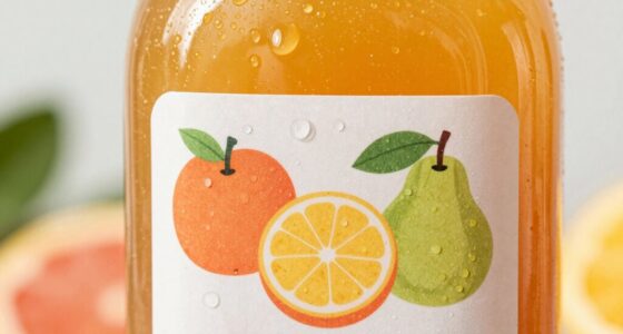
To use color psychology effectively in your juice bottle design, choose colors that match your product’s qualities and target audience. Bright oranges and yellows signal freshness and tanginess, while green communicates health and natural ingredients. Red can evoke excitement, and blue builds trust and a calming vibe. Select contrasting yet harmonious palettes to grab attention and reinforce your brand message. If you keep exploring, you’ll discover how to craft a design that truly resonates with your customers.

Get kitchen staples and gadgets delivered free with Prime
- Fast, free delivery on millions of items
- Prime Video, Amazon Music and more included
- Member-only deals all year
Key Takeaways
- Choose bright oranges and yellows to emphasize freshness, tanginess, and citrus flavors in juice packaging.
- Use green hues to convey natural ingredients, health benefits, and eco-friendliness.
- Incorporate red accents to evoke excitement and highlight berry or tropical flavors.
- Opt for blue tones to suggest trustworthiness, purity, and wellness qualities.
- Ensure color choices align with target cultural perceptions to maximize consumer connection.
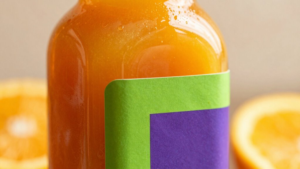
When designing juice bottles, understanding how color influences consumer perception can make a significant difference. The colors you choose for your packaging do more than just look appealing—they evoke specific emotions and associations that can sway purchasing decisions. The recognizing color associations is essential because they shape how your product is perceived before a customer even takes a sip. For instance, bright oranges and yellows tend to be associated with freshness, vitality, and tanginess, making them perfect for citrus-flavored juices. Green hues often evoke health, natural ingredients, and eco-friendliness, aligning well with organic or plant-based options. Red can induce feelings of excitement and passion, often linked to berry or tropical flavors, while blue might suggest calmness, purity, and trustworthiness, suitable for premium or wellness-focused products.
Choosing colors that evoke freshness, health, or tranquility shapes consumer perceptions before tasting.
Your goal is to harness these associations to influence consumer perception positively. If you want your juice to appear ripe, natural, and invigorating, choose vibrant, energetic colors like orange or yellow. These hues can make your product stand out on shelves and instantly communicate flavor and freshness. Conversely, if health and wellness are your primary messages, integrating shades of green or soft earth tones can reinforce those qualities. When consumers see green bottles or labels, they often think of organic ingredients and sustainability, which can increase their trust and willingness to try your product. Additionally, understanding cultural color meanings can help you tailor your packaging to diverse markets and avoid misinterpretations. Being aware of color symbolism across different cultures ensures your branding resonates positively worldwide.
It’s also imperative to consider cultural color meanings, as perceptions can vary across regions. For example, while red is often associated with excitement and appetite in Western countries, it might carry different connotations elsewhere. Hence, aligning your color choices with your target audience’s cultural expectations ensures your message resonates. Additionally, contrast and harmony matter. Bright, contrasting colors can grab attention, but harmony in your color palette creates a cohesive, appealing look that builds brand recognition and trust. Incorporating color psychology principles into your design can further enhance visual impact and emotional connection with consumers. Testing different color schemes with your target market is crucial, as it helps you understand which combinations evoke the desired responses and strengthen your branding efforts.
Your choice of bottle color and label design should work together to reinforce your brand message. Think about how the colors reflect your product’s qualities and how they will be perceived at a glance. Testing different color schemes with your target market can provide valuable insights into what truly appeals to your audience. Ultimately, by carefully selecting colors based on their associations and understanding how they influence consumer perception, you can create a compelling, attractive juice bottle that draws customers in and communicates your brand’s unique qualities effectively.
As an affiliate, we earn on qualifying purchases.
Frequently Asked Questions
How Does Color Psychology Influence Consumer Purchasing Decisions?
Color psychology influences your purchasing decisions by triggering specific emotional responses through color symbolism. Bright, vibrant hues like orange and yellow evoke feelings of energy and freshness, making you more likely to choose a juice that appears lively and appealing. Conversely, calming colors like blue suggest trust and purity. Your subconscious associates these colors with quality and taste, guiding your choices without you even realizing it.
What Colors Are Most Effective for Attracting Health-Conscious Buyers?
You’ll want to choose vibrant color schemes like fresh greens, oranges, and berries to attract health-conscious buyers, as these evoke freshness and energy. Monochrome minimalism with clean, simple designs also appeals to this crowd, signaling purity and trustworthiness. This approach helps you stand out on the shelf, making your juice look natural and wholesome. Remember, when it comes to health-conscious consumers, colors speak louder than words.
How Can Color Contrast Improve Juice Bottle Visibility on Shelves?
You can improve shelf visibility by using strong color contrast on your juice bottle design. Bright, contrasting colors make your product stand out among competitors, catching the eye of shoppers. Incorporate bold hues against neutral backgrounds or complementary colors to create a striking visual effect. High color contrast draws attention quickly, making your juice more noticeable on crowded shelves and increasing the likelihood that customers will pick it up.
Are There Cultural Differences in Color Perception for Juice Packaging?
When it comes to color perception, you should be aware that cultural symbolism and regional preferences influence how consumers interpret your juice packaging. Colors carry different meanings across cultures, so a color that signifies health in one region might symbolize luck or prosperity elsewhere. Don’t assume all audiences see colors the same way; tailoring your design to regional tastes guarantees your message resonates and avoids misinterpretation.
How Should Seasonal Colors Be Incorporated Into Juice Bottle Design?
You should incorporate seasonal palette integration by using colors that evoke the specific time of year, like warm reds and oranges for fall or cool blues and whites for winter. Incorporate festive color schemes with accents like gold or silver to add a celebratory touch. This approach makes your juice bottles more appealing, aligning with consumer emotions during holidays or seasons, and enhances brand recognition through timely, seasonally appropriate visuals.
Conclusion
By applying color psychology thoughtfully, you can make your juice bottles more appealing and memorable. Remember, colors can boost brand recognition by up to 80%, so choose hues that evoke the desired emotions and attract your target audience. Whether it’s vibrant reds for energy or calming greens for health, the right colors can influence buying decisions and set your product apart in a crowded market. Use color strategically, and watch your sales grow.
NFL season / tailgating Picks
team gear
As an affiliate, we earn on qualifying purchases.